Blog
Preparing MATLAB figures for publication
For us researchers, writing documentation and preparing manuscripts for publication is a large part of our work. And often, the most important parts of our written documents are the figures that visualize the data we generated. As my tool of choice for most calculations is Matlab, most of my data ends up in the Matlab workspace at some point and gets plotted from there. In order to prepare Matlab figures for publication, some modifications should be made to the figures. In the following, I will explain the main steps I usually take. I know, there are probably thousands of articles on this topic available out there and at least as many opinions on what is right or wrong, but I have also been asked often enough about how to export Matlab plots. The following list describes by no means the perfect or the only way to do things, but it summarizes the most important steps and commands necessary to obtain nice figures of your data that can be imported into the text editing program of your choice.
Step 1: Colors and line styles
Colorful figures are nice to look at on the computer screen and help distinguishing different aspects. However, a figure that’s meant for publication also has to be readable in greyscale, as most documents are not printed in color. Luckily, the new Matlab color scheme ‘Parula’ (since Matlab 2014b) offers 7 colors with quite a wide spread of brightness:
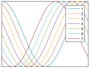
Figure 1: The seven line colors of the new Matlab color scheme Parula.
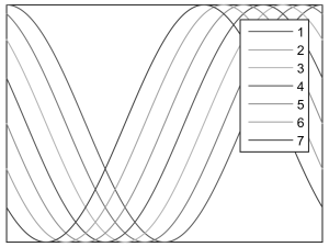
Figure 2: The 7 line colors of the Parula color scheme printed in greyscale.
Nevertheless, I would not use more than 3 different colors in the same plot, because not all of the 7 colors are well distinguishable in greyscale. The grey values of the standard colors can be calculated by typing:
rgb2gray(get(groot,'defaultAxesColorOrder'))
Combinations that work well in color and greyscale are the first three colors (blue, red, and yellow) for three-line plots and the last two colors (light blue and ruby) for two-line plots.
Another way to make lines distinguishable in greyscale is by using different line styles. But as soon as you need more than two of them (solid and dashed) things get complicated…
Step 2: Scaling
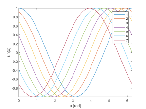
The next important step after adding all lines and annotations to the plot is scaling it to the desired size. You want to do this before exporting the plot, as font sizes and line widths are not preserved when a figure is cropped after exporting. The following figure, which was a standard size figure in Matlab, was exported to a raster graphics format before cropping it to the final width, making the axes labels and the legend hard to read in the typical width of a one-column figure (around 8 cm).
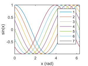
In Matlab, scaling the figure is done by setting the third and fourth element of the figure’s position property to the desired final value (here: 8 cm x 6 cm):
fig.Units               = 'centimeters';
fig.Position(3)         = 8;
fig.Position(4)         = 6;
Here fig is the figure handle you can get when generating a figure:
fig = figure;
or from the current figure handle:
fig = gcf;
The maximum width for one-column and two-column figures, respectively, is usually given by the journal you want to submit to. Or, if you are using a latex template, you can output the required widths with the \the command:
\the\hsize
Step 3: Text formatting
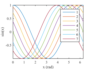
Often journals require a minimum font size, or you just want the font in your figures to be the same type and size as in the rest of your text. As the plot in the final document will now appear in the same size as in the Matlab figure, it makes sense to directly format the text in the axes labels and legends as desired.
set(fig.Children, ...
    'FontName',     'Times', ...
    'FontSize',     9);
As text annotations are no direct children of the figure, they have to be formatted separately.
Step 4: Removing unnecessary white space
As the white space surrounding the plot wastes a lot of the precious figure space, especially for small figures, it should be removed (or minimized) in the next step:
set(gca,'LooseInset', max(get(gca,'TightInset'), 0.02))
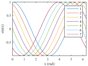
Figure 6: Figure with minimized white space.
Step 5: Exporting
Finally, the figure can be exported to the desired graphics format. This can be done with the saveas command, but the print command allows for the definition of more attributes of the exported file. But first, in order for the exported file to have the same size as the Matlab figure, it’s necessary to first set the PaperPositionMode to automatic:
fig.PaperPositionMode = 'auto';
The following command exports the current figure to a png file with 600 dpi resolution:
print('img/my_figure', '-dpng', '-r600')
If using vector graphics, ‘-dpng’ can be replaced by ‘-epsc’ for colored eps. However, as many journals convert the figures to raster graphics anyway, it’s often better to directly convert the figures to avoid problems of subsequent conversion.
Summary
Probably the best summary of this blog entry is the following code, which was used to plot and export the last figure. Feel free to use it as a starting point for your own figure exporting routine and adapt it to your liking.
% define figure properties
opts.Colors     = get(groot,'defaultAxesColorOrder');
opts.saveFolder = 'img/';
opts.width      = 8;
opts.height     = 6;
opts.fontType   = 'Times';
opts.fontSize   = 9;

% create new figure
fig = figure; clf

% plot sin-curves with the 7 standard colors
x = linspace(0, 2*pi, 1e3);
for i = 1:size(opts.Colors,1)
    h = plot(x, cos(x + (i-1)/8*pi)); hold on
end

% add axis labes and legend
axis tight
xlabel('x (rad)')
ylabel('sin(x)')
legend('1','2','3','4','5','6','7')

% scaling
fig.Units               = 'centimeters';
fig.Position(3)         = opts.width;
fig.Position(4)         = opts.height;

% set text properties
set(fig.Children, ...
    'FontName',     'Times', ...
    'FontSize',     9);

% remove unnecessary white space
set(gca,'LooseInset',max(get(gca,'TightInset'), 0.02))

% export to png
fig.PaperPositionMode   = 'auto';
print([opts.saveFolder 'my_figure'], '-dpng', '-r600')
